The JQM select control works by replacing a standard HTML select element with a jQuery widget. This widget removes HTML select control by placing it outside the visible area of the browser window using CSS positioning. Below is the CSS snipet in question. It can be found in the jquery.mobile-1.0a2.css file.
.ui-select select { position: absolute; left: -99999px; }
The select element is then replaced by the mobile.selectmenu defined in the jquery.mobile-1.0a2.js file. The select element is replaced by a style anchor tag and the select's options are moved into an unordered list. The unordered list is displayed as a modal dialog when the anchor is clicked.
Here is a screen shot of a jQuery Mobile select widget that allows a user to select a U.S. state.
Here is the model dialog that displays the select options.
As you can see the implementation is visually very attractive, in my opinion. However the alpha implementation seems buggy. In my experience the when the options modal dialog is closed the form page sometimes moves to the top rather than displaying the area that visible when the select anchor was clicked. Mobile browser makers have done a good job making select controls easy to use and there isn't a significant benefit to be gained from re-implementing the select control.
In order to restore the default select element I have created a very basic patch that will override the JQM widget. Below is the relevant code which needs to be invoked in the document ready event. I have provided a link to a page that contains an example of the replacement widget including the JavaScript code at the end of this post.
jQuery.widget( "mobile.selectmenu", $.mobile.widget, {

 options: {

  theme: null

 }, //end options


 _create: function(){

  var select = this.element,

   o = this.options,

   theme = o.theme;


  //get parent's theme

  if ( !theme ) {

   var themedParent = this.element.closest("[class*='ui-bar-'],[class*='ui-body-']");

   theme = themedParent.length ?

   /ui-(bar|body)-([a-z])/.exec( themedParent.attr("class") )[2] :

   "c";

  }


  //apply styling to label

   selectID = select.attr( "id" );

  label = $( "label[for="+ selectID +"]" ).addClass( "ui-select" );

  select.addClass("ui-corner-all ui-shadow-inset ui-body-null ui-body-" + theme);


  //apply additional styles/markup to more closly match select element with input elements

  select.css("font-size", "100%");

  select.css("padding", ".4em");

  select.wrap('');

  select.css("margin-bottom",".3em");


 } //end _create function

});
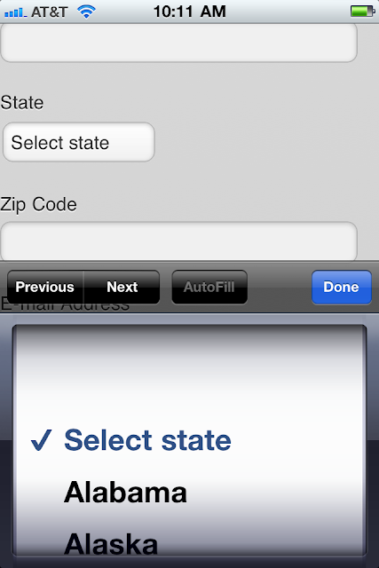
Below is a screen shot of the resulting page. The select element uses the default behavior for the Safari browser. The control has also been styled to appear similar to the input controls on the form. Please note that the code above is intended as a proof of concept, use at your own risk.
References
jQuery Mobile Project
http://jquerymobile.com
Page which uses jQuery Select Element
http://www.customdatasys.com/jqm/v1/form.html
Page which uses the patch
http://www.customdatasys.com/jqm/v1/form-modselect.html


No comments:
Post a Comment